In the Portal design agenda we adapt the look of the portal to the visual style of our institution — the logo, the icon, the intro image and the colours. We open it from the menu with Portal administration → Portal design. The page has five tabs; we switch between them with the buttons in the header of the card.
Images
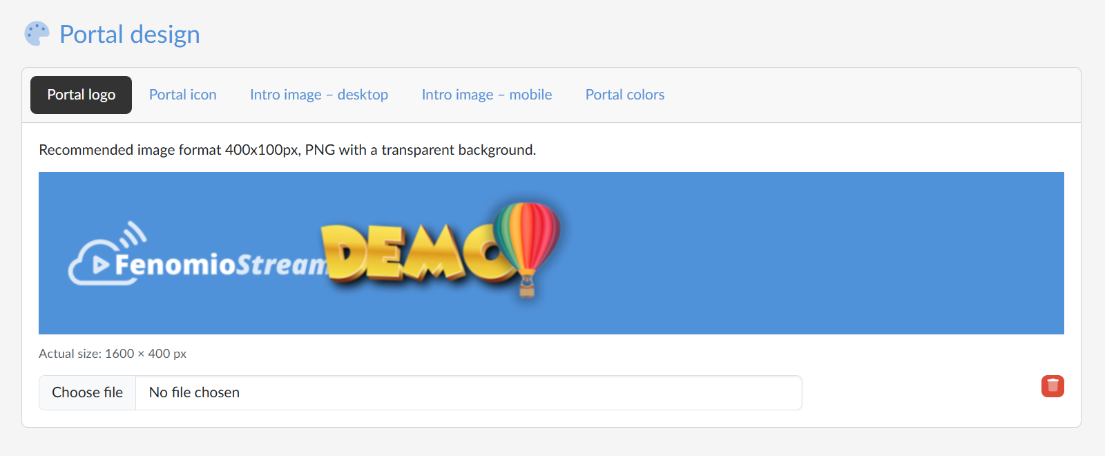
The first four tabs are for uploading images and work the same way. At the top is the recommended format, below it a preview of the current image and its actual size. We upload a new image by selecting a file in the field below the preview — it is saved immediately, without further confirmation. With the bin icon  we remove the image.
- Portal logo — shown in the header of the portal. Recommended format 400×100 px, PNG with a transparent background. The preview is drawn on the header colour, so we can see straight away how readable the logo will be.
- Portal icon — a small icon in the browser tab and in bookmarks. Recommended format 100×100 px, PNG with a transparent background.
- Intro image – desktop — the strip with the intro image at the top of the Introduction page on wide screens. Recommended format 2600×100 px, JPG.
- Intro image – mobile — the same strip for narrow screens. Recommended format 600×100 px, JPG. If we do not upload it, the desktop image is used on mobile devices too.
Portal colours
On the fifth tab we set the colours. We pick each one from the palette or type its code into the field next to it:
- Header main color — the background of the top bar of the portal;
- Header secondary color — the colour of the text and icons in the bar;
- Primary accent color — the colour of buttons, links and highlighted elements;
- Secondary accent color — the colour of supplementary elements.
The last field, Height of the intro image, sets in pixels the height of the strip with the intro image on the Introduction page.
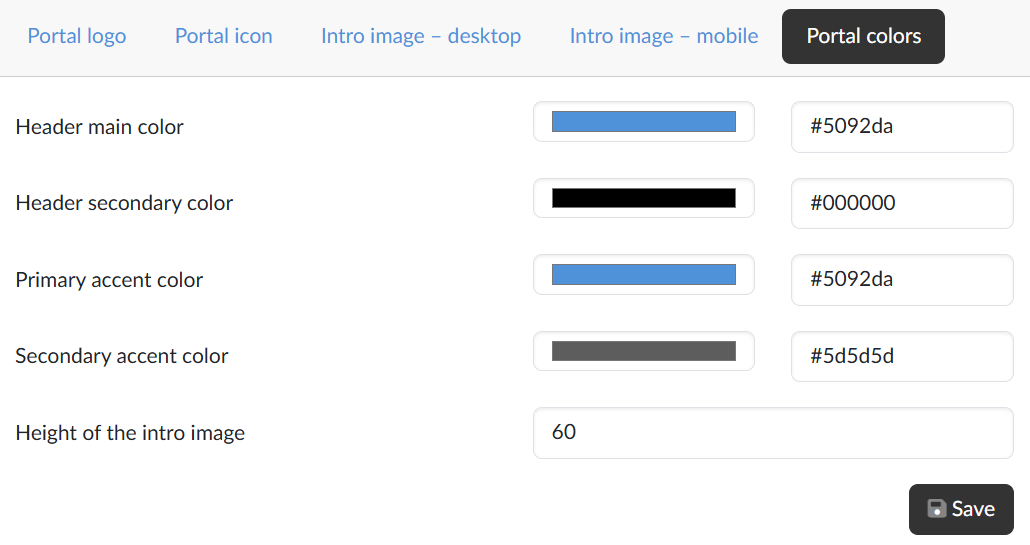
Unlike the images, the colours and the height are saved only with the Save button. The change shows in the public part of the portal and in the administration.